Setting up Loupedeck for Rebelle 5 or 6

This page provides help and guidance to setup and use the Loupedeck (Live) with Rebelle 5.

I have now added my latest one for Rebelle 6 as well:

You can help support me by buying the Loupedeck through my Amazon affiliate Link for Loupedeck

Step 1 – Download and Extract the Profile

Rebelle 5:

The .zip file above contains a single profile. Extract the zip file to get the file “Rebelle-5-BasementPicasso.lp4”

Rebelle 6:

The .zip file above contains a single profile. Extract the zip file to get the file “rebelle-6-BasementPicasso.lp4”

Step 2 – Import the profile into Loupedeck

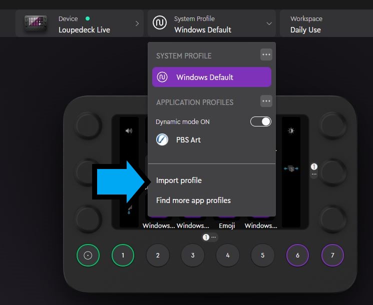
On the system profile dropdown, select “Import profile”

Browse to the file that you extracted in step (1)

Step 3 – Configure Rebelle Short-cuts

Due to a couple of conflicts on my system, I had to change a few of the default key configurations in Rebelle. In Rebelle 5 key configuration, make sure that your keys are set up as follows:
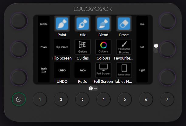
Command (Keys)SectionKey
PaintTools1
MixTools2
BlendTools3
EraseTools5
Flip Viewport (Screen)ViewShift + F
ReDoEditF6
UndoEditF5
GuidesViewShift + Y
Colour SetWindowF9
Favourite BrushesWindowF8 then Shift + B (macro)
Full ScreenViewShift + Ctrl + F
Tablet ModeTab
Command (knobs)SectionKey
Fit to Screen (Rotate Reset)View. {a full stop}
Rotate CounterclockwiseViewCtrl + Shift + {left arrow}
Rotate clockwiseViewCtrl + Shift + {right arrow}
Fit to Screen (Zoom Reset)View. {a full stop}
Zoom OutViewCtrl + Shift + O
Zoom InViewCtrl + Shift + I
Reset Brush Changes ToolsCtrl + Shift + H
Brush Size IncreaseToolsCtrl + F1
Brush Size DecreaseToolsCtrl + F2
Increase HueColorCtrl + F3
Decrease HueColorCtrl + F4
Increase Saturation ColorCtrl + F5
Decrease Saturation ColorCtrl + F6
Increase LightnessColorCtrl + F7
Decrease LightnessColorCtrl + F8
Open Colour DialogColorCtrl + F9

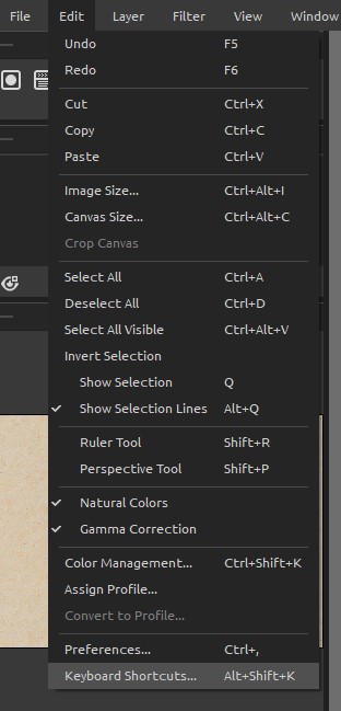
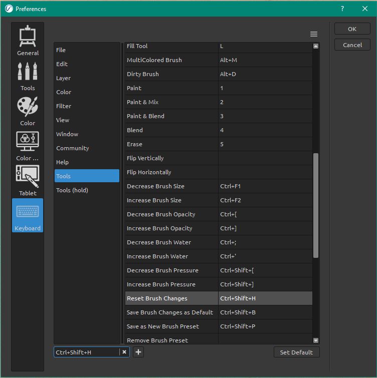
Select Edit -> Keyboard Shortcuts (or press Alt + Shift + K to open it directly)

Selects the correct key section, for example “Reset Brush Changes” is under Tools

Make sure that the assigned key is as shown in the table above. If it prompts you that the combination is in use, confirm Ok to replace the existing use of that combination.

Further Customisation of Loupedeck

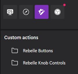
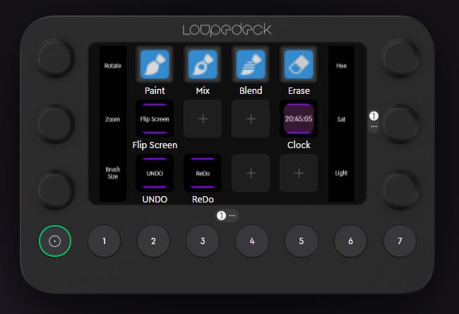
Hopefully, the guide above will get you up and running. This section explains how to add any specific custom controls that you might want to use. The controls that I have created in Loupedeck are macro functions for key presses and custom adjustments for knob controls. They are grouped into two folders. Rebelle Buttons are the visual keys, Rebelle Knob Controls are the rotary functions.

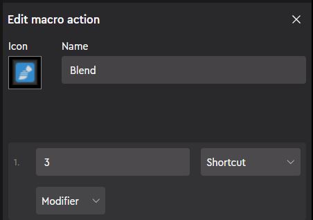
The macro buttons appear visually on the loupedeck. In the example on the right, the Blend function, when pressed, passes the key press “3” to Rebelle (i.e. as if the user had pressed “3” on the keyboard. The icon is the visual shown on the loupedeck key. Without an icon, the key will just show text

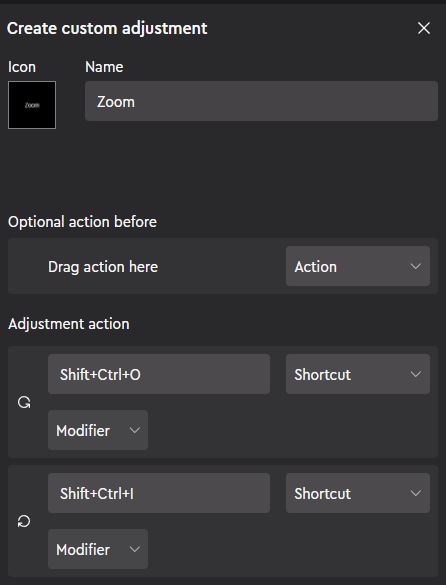
Rotary Keys, for example the Zoom function are slightly more complicated as they need to effectively send different key presses depending on whether you rotate clockwise or counter-clockwise. The top adjustment action is the rotate counter-clockwise, so in this case it sends Shift + Ctrl + O (for Zoom Out).

The icon (if used) will show next to the knob, otherwise the Name is used as text.

Second Video for Rebelle 5

Back at the end of 2021 I was delighted to be selected as a featured artist for Rebelle Art software by Escape Motions. Some of my work is now featured on Escape Motion Site. I have done a couple of one-hour tutorial videos for them, and the second one is now live.

Digital Painting using Rebelle 5

In this 1 hour demonstration I show you the whole process, all the steps & all the assets that I use. There is a combination of real-time footage for the key steps and time-lapse to speed up the whole demo – but all fully narrated.

Session One – Initial Work

  • Getting started – picking initial colours
  • Time lapse – initial block in
  • Initial loose sketch added – lines coloured
  • Time lapse – second block in
  • Adding shadow mask & wash
  • Time lapse – initial shadow wash
Output from session 1

Session Two – Structure and Texture

  • Time lapse – painting / freehand washes
  • Adding random marks
  • Time lapse – marks, painting and washes
Session 2 output

Session Three – Adding Detail

  • Adding red background & random text
  • Time-lapse – painting and washes
  • Adding detailed sketch & colouring lines
  • Time lapse – colour lines
  • Zoomed in detail work
  • Time lapse – detailed painting
Output from session 3

Session Four – Refining Detail

  • Adding a detailed mask
  • Time lapse – darkest washes & detail
  • Adding random finishing touches
Final image

Rebelle Featured Artist

Back at the end of 2021 I was delighted to be selected as a featured artist for Rebelle Art software by Escape Motions. Some of my work is now featured on Escape Motion Site. I have done a couple of one-hour tutorial videos for them, the first one of which is now live.

One hour demonstration tutorial on using Rebelle 5

The images below show a step by step of the work in progress

Stage 1 – Initial block in
Stage 2 – washes and initial detail
Stage 3 – Refining the detail
Stage 4 – Finishing touches, shapes and text

Art Review 2017 #3

Starting with a quick sketch that was done on the iPad, just laying around one evening with brushes and textures and it ended up turning into a little painting from imagination

One of the main challenges continues to be the use of physical textures overlayed onto the digital painting (or working under them in this case). Still hard to get the right balance as a lot of marks from the painting get lost with the texture over them. Also the texture is a little dominant in this – have been working on the settings to try and get it to blend in a bit more naturally – here the shadows of the texture are a little too black.

The next few were digital work done from some of my reference photo work. In the first one I was looking at separating out the shadow from the mid & light – thinking about how this can be used as a reference for the dark wash layer (using the traditional technique of building up dark colours slowly with layers of thin washes. Done in photoshop and then a combination of digital and manual blurring.

This was then a very quick digital rendition with the black shadow layer masked and then painted in. It is clear that the shadow layer edges are far too crisp even after the blurring and softening

The next one used a similar principle but this time with a drawn sketch for the dark wash areas

Kept the painting very loose

And the brought the two together and worked up the painting a bit more.

Overall, getting agood balance of mark making, colours shapes and textures. Looking back on this – quite pleased with this for a rough bit of work.


Video – iPad sketch of Girl sitting

Continuing the review of slightly older work, this was a digital painting done, starting from life to sketch out various ideas, then using a reference photo to work on digitally

This was the output from the set of thumbnail sketches from life – just looking at various composition options. Like the last option of the drawing sort of breaking out of it’s border

Tried to go with that theme and select an area to focus on


Stage 1 with a lot of the shapes roughed in. Was trying to use a lot of text and texture brushes to keep small level detail interesting


After a bit more refinement with some wash brushes to darken and bring up the contrast


Towards the end, with some texture being vrought in

Overall, the break-out effect of the final piece isn’t quite as subtle as the original drawing and the harder borders of the painted image work against the looseness that the drawing had, but overall, lots of nice elements in this.


Art Review 2017 #2

Based on a reference photo taken on holiday in Carradale, this was some experimental work again looking at using PostWorkshop 3 to try and work out the steps involved in my art  process and the thinking behind the construction of an image.

The main aim was to try and split the painting of the light and dark into two slightly different styles, with light being thicker more textured paint and dark being translucent washes of colour. That is trying to produce digitally a highly traditional approach.

The first one shows the base painting using some of my custom mark brushes I have been working on.

354-Test Project 2g


The second shows the dark areas being brought out through colour washes


354-Test Project 2f

Finally combining the two along with some texture detail added

354-Test Project 2h


Looking back at this there are some nice areas – some of the marks and colours under the bridge are quite nice and some of the colours in the wash are really nice. The foreground doesn’t work as well – stones are two digitally processed and linear and some of the texture is a little crude, doesn’t integrate well, but overall, not a bad rendition of what I am trying to work towards.

The next one is all digital, including the tears & collage effect. Then manually digitally painted on top. On reflection there is nice marks coming through but the colours aren’t working particularly well. The blue is a little pure and bland and the white isn’t working well with the texture. Also the texture dominates and the main problem I was having (and still do) is to get the painted marks to provide a texture of their own that can override the base textures effectively. When seen at larger scale the marks tend to flatten over the underlying texture without bringing their own through which just looks wrong. The more abstract beach area is quite good though and I like some of the browns and grey in that area.

355-Carradale

Art Review 2017 #1


This is the first article in a review of work done over the last year or so. It is always good to try and look back at some of the work that was done and think back to what I was aiming for or thinking about. Quite often I find that images I got really fed up with or gave up on, when you review them later with fresh eyes seem better than I remember.

First one is an iPad sketch/painting that was later worked on in ArtRage. Has some nice texture and marks but was one of many that struggled with balance of marks & size versus strength of texture.

350-05-Pose A Face and hand


In the next one I was trying to get bigger shape/marks to get more interest, but started to struggle with losing a lot of definition. Probably needed more detail in the centre of interest around the fingers and toes.

350-03-Josie-B-Hand and foot

The next four were output from playing with a plugin called PostWorkshop 3 (now replaced by PhotoDonut). Spent quite a while looking at trying to mimic (and develop) my drawing process


353-21 texture


353-23 texture

Get some quite nice abstract sort of renderings but ultimately had a lot of issue trying to scale the work up (worked well & quickly at lower resolutions but was extremely slow and crashed a lot at higher ones)

353-24 texture

353-25 texture


Life Drawing Session at Leith School of Art

Last session of the year – had the pleasure of working with the model Topaz for a 4 hour drawing session, starting with quick poses then moving onto a single pose for three hours (with breaks of course). Very good pose – very well held.

Quick Sketches

the quick sketches started of with a few 5 minutes followed by one 10 minutes:

lsoa_10_dec_quick1 lsoa_10_dec_quick2

Finally a 15 minute quick sketch

lsoa_10_dec_quick


Finished Painting:

Quite pleased with the finished painting. Starting to get a nice balance of texture, shape and colour. Working almost exclusively from a limited palette has helped keep a colour consistency throughout I think.

lsoa_10_dec

New sketch with Painter 2015

This is a painting from life done at Leith school of Art today using Corel Painter 2015 on a surface pro 3. I have created a composite below with a few close ups (click on image for 100% view) which shows some of the textures a bit better. Quite pleased with this one.


lsoa_20-06-2015-composite

May 23rd Oil Sketch

lsoa may23 a
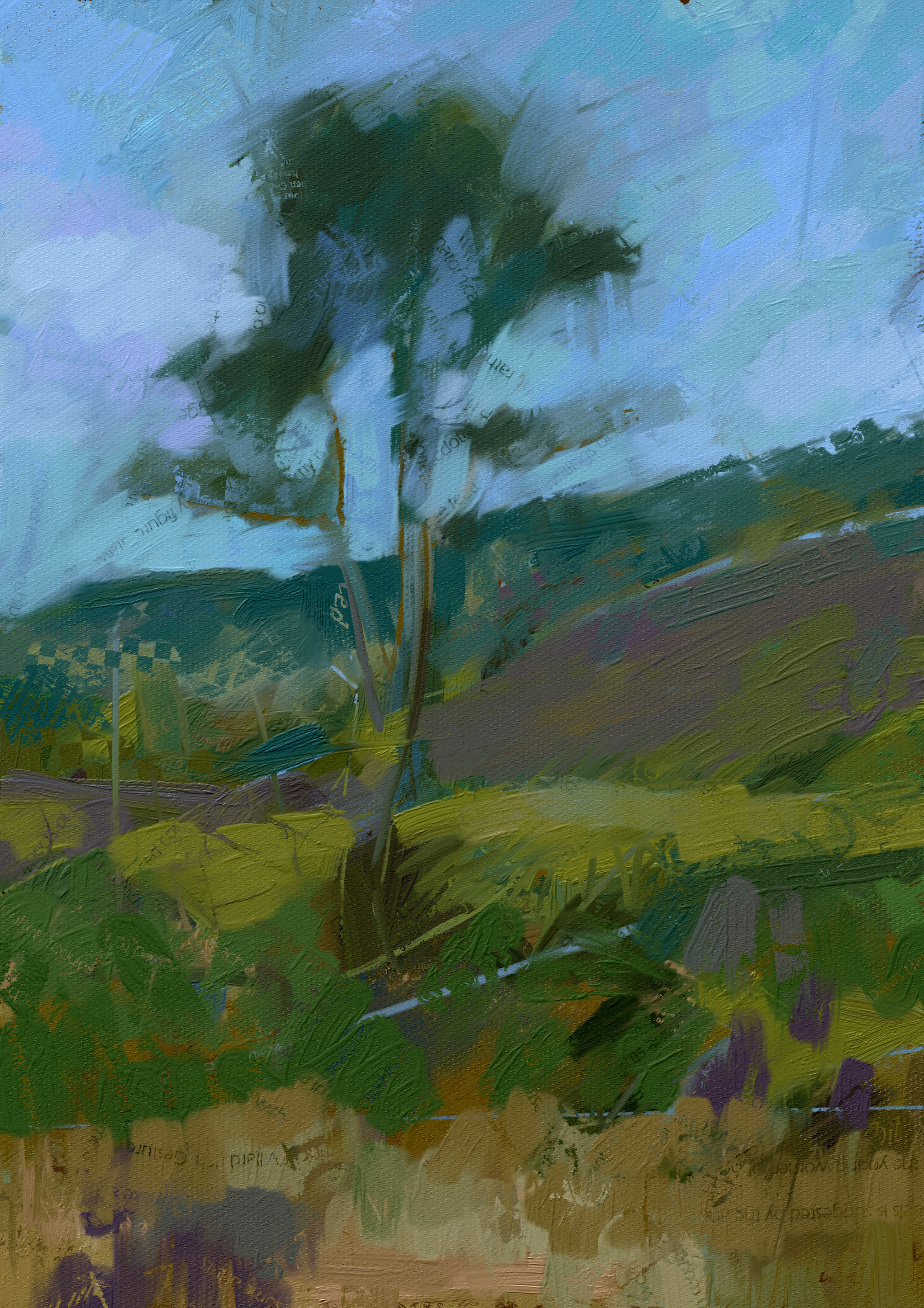
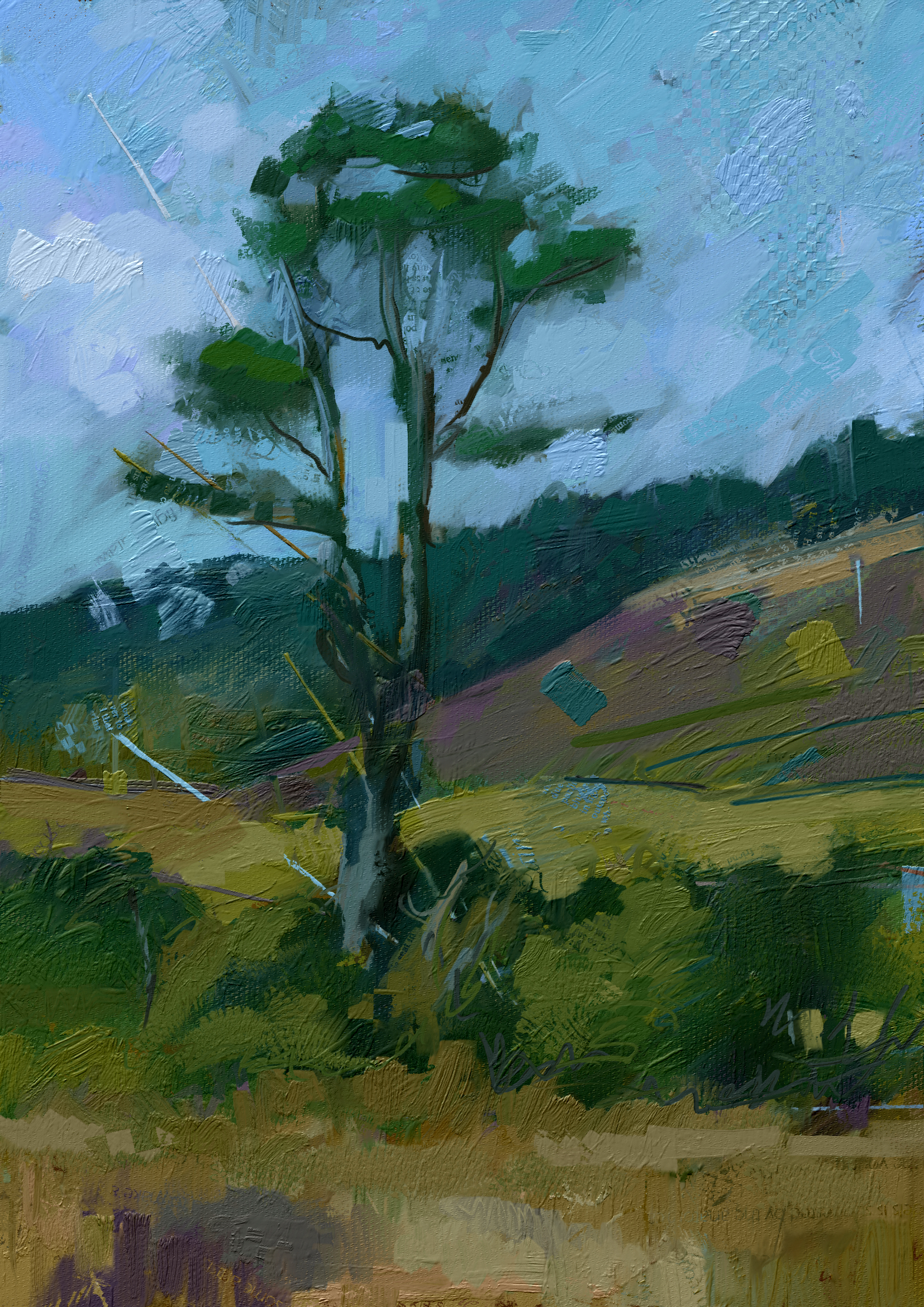
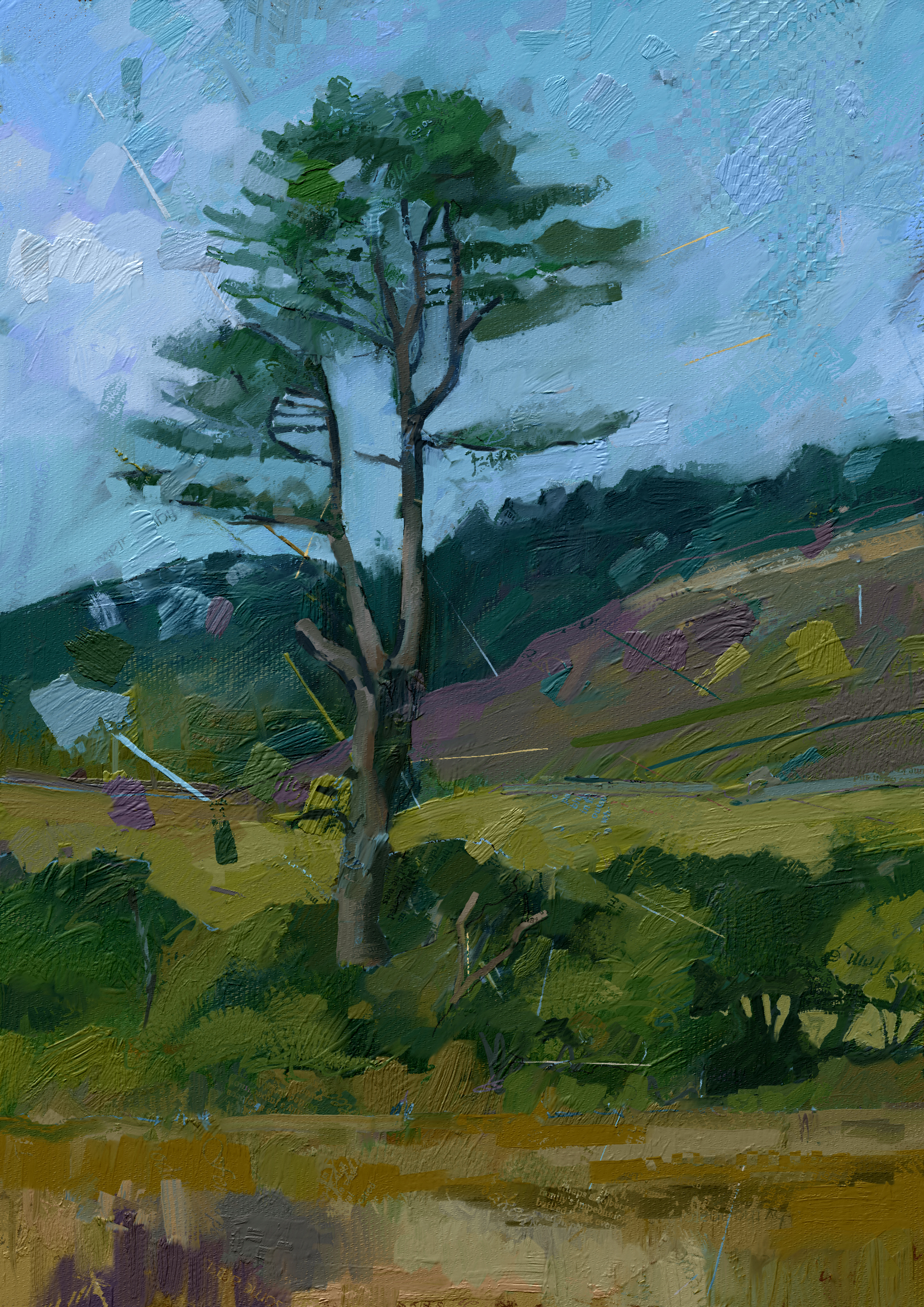
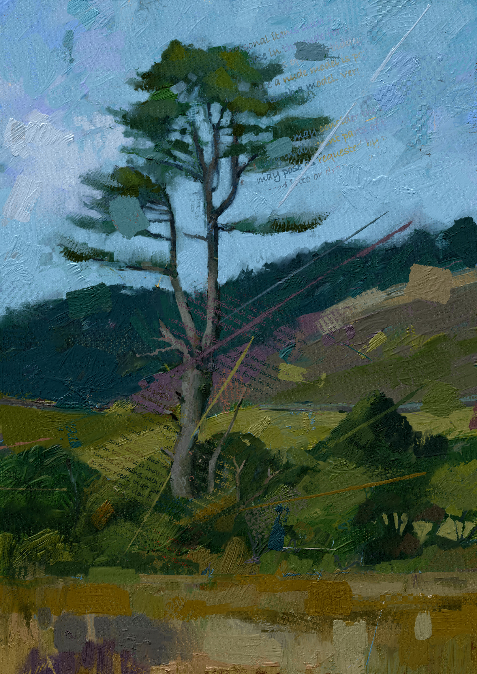
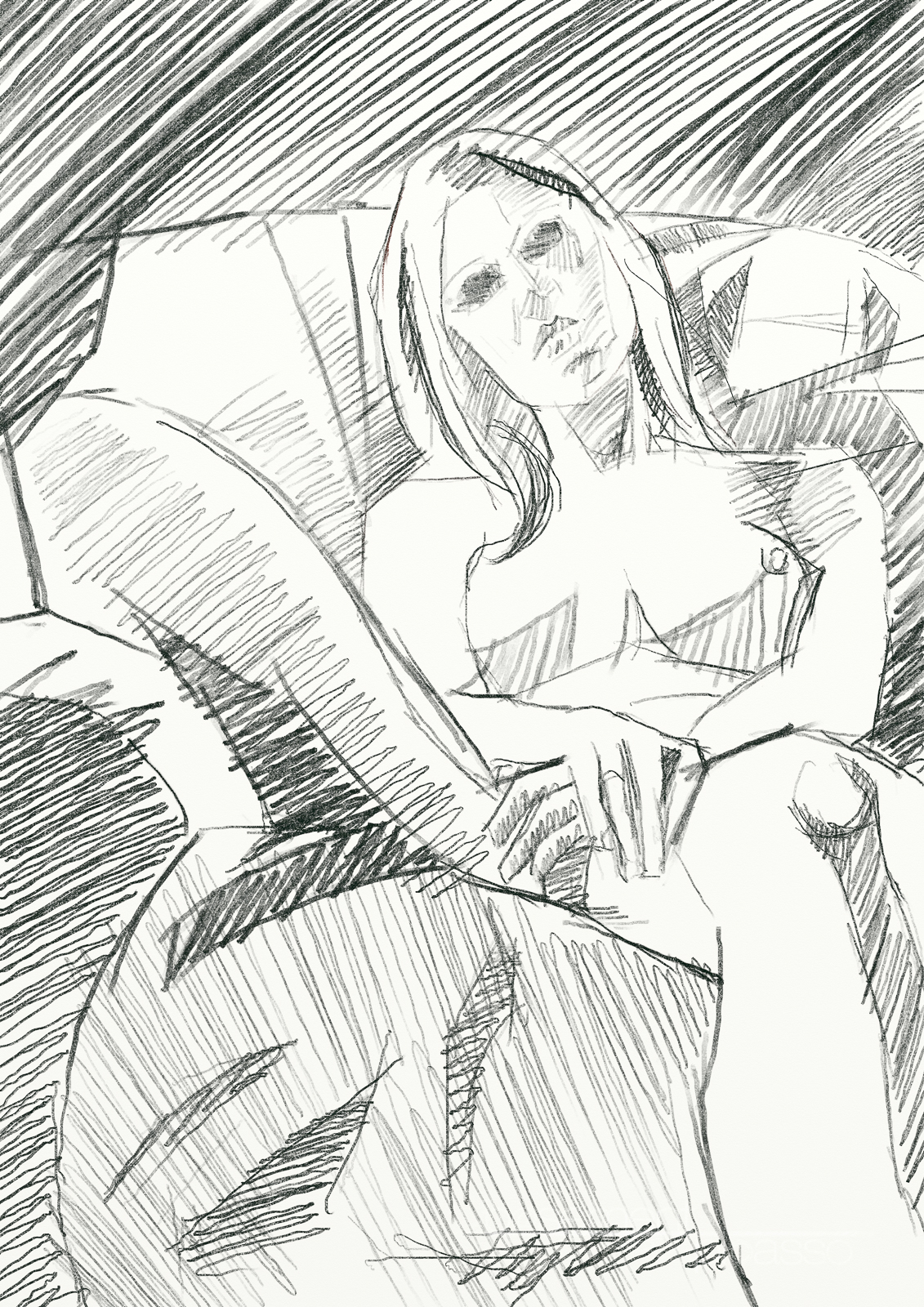
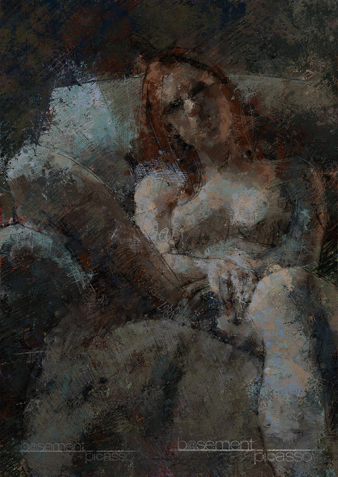
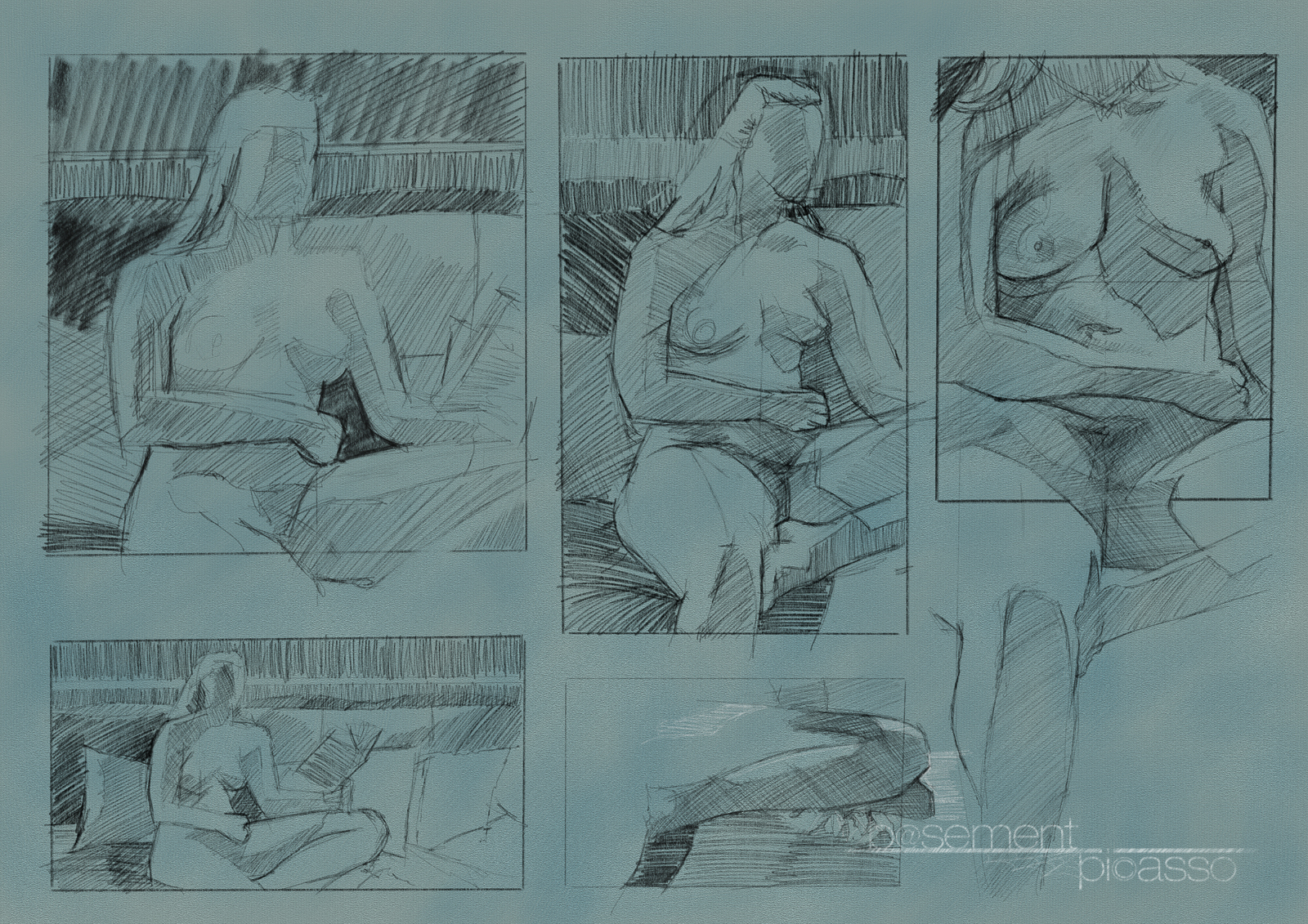
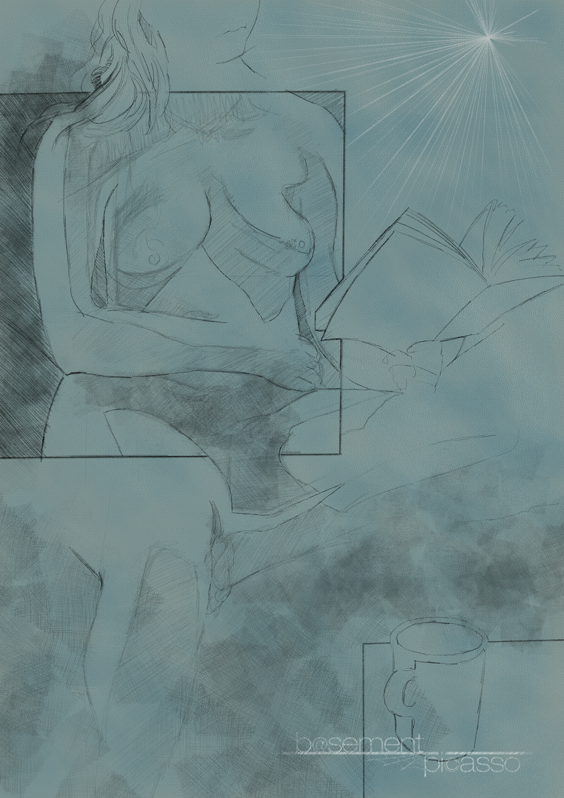
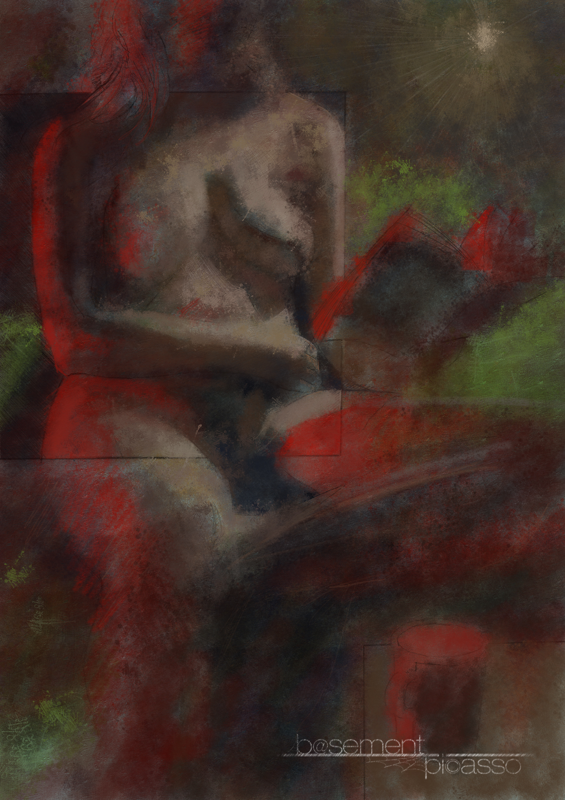
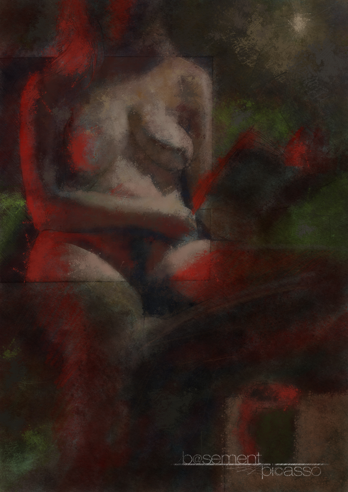
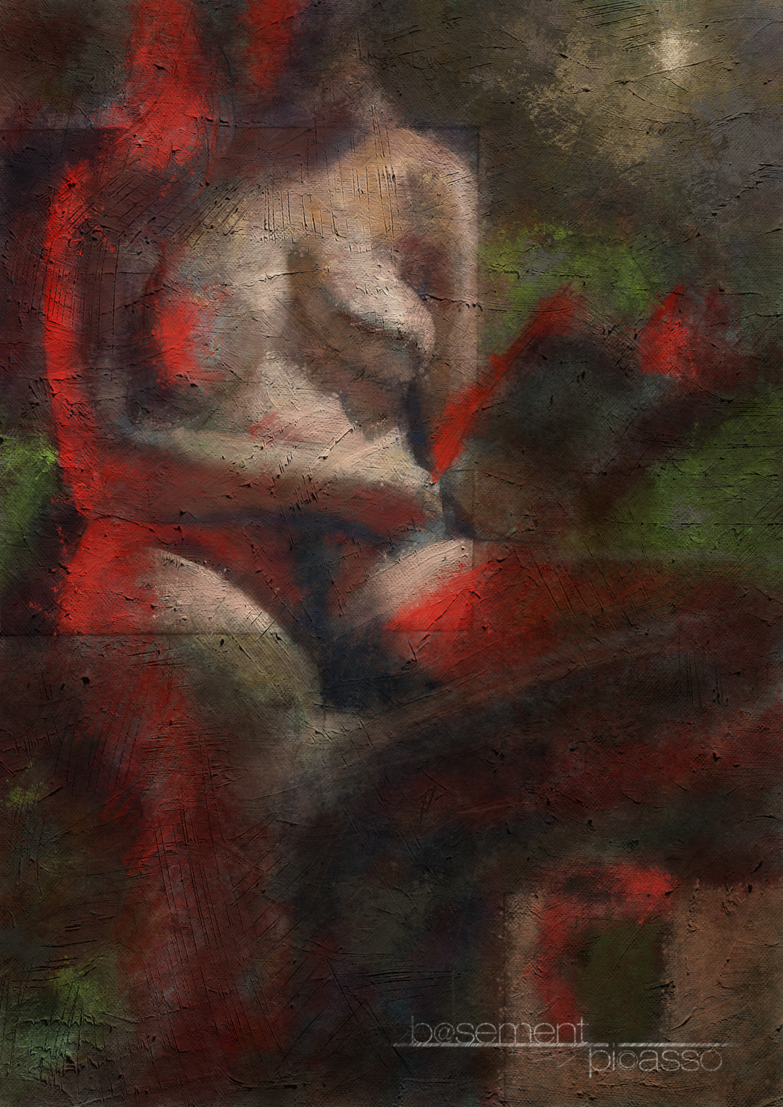
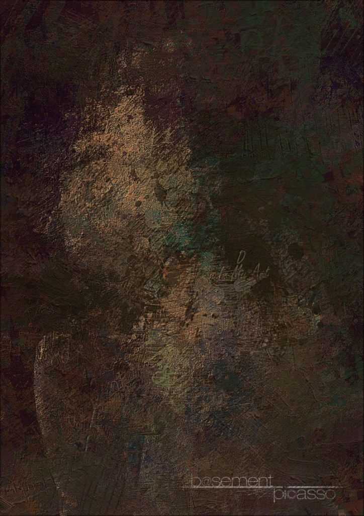
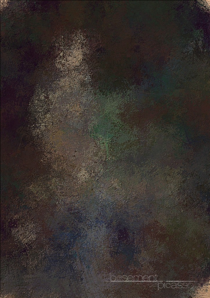
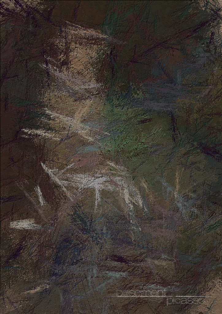
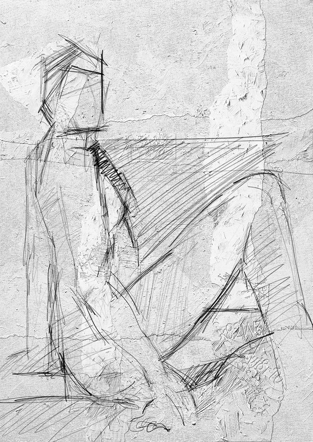
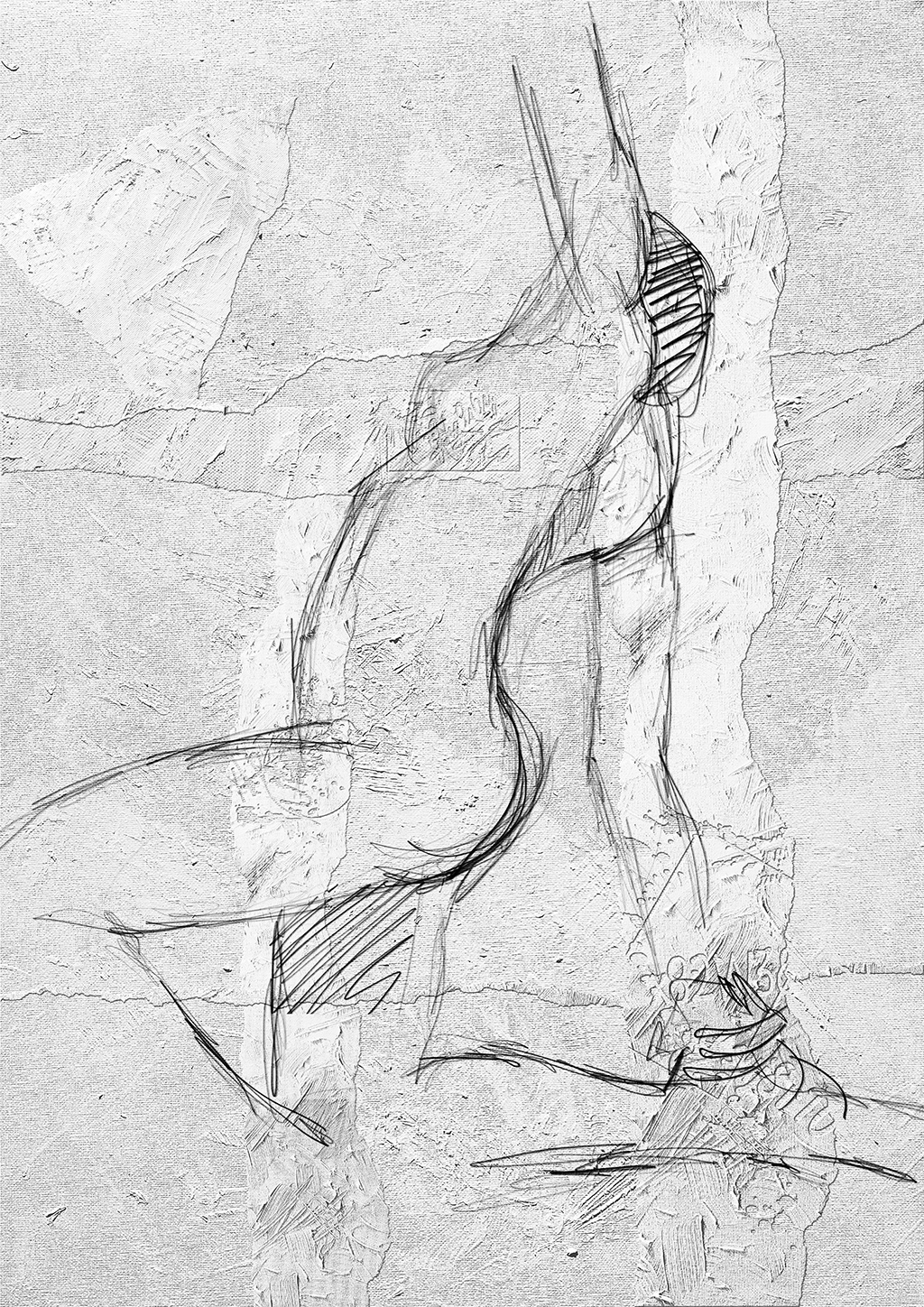
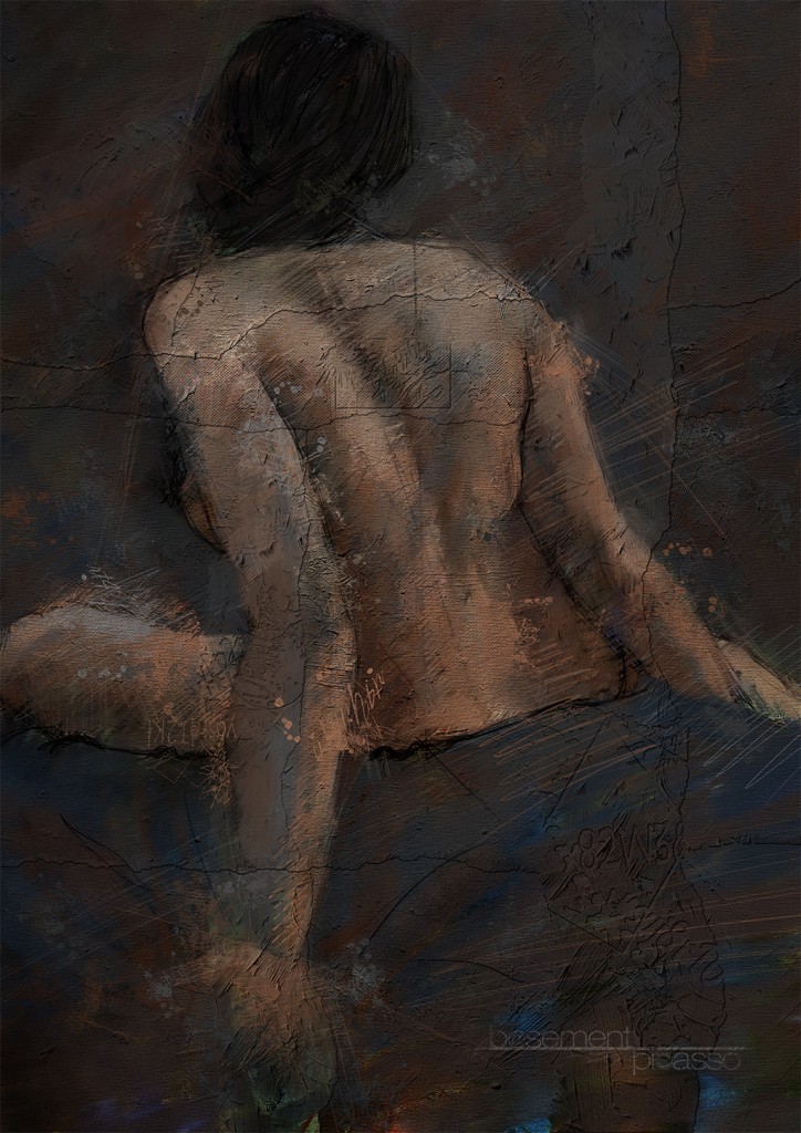
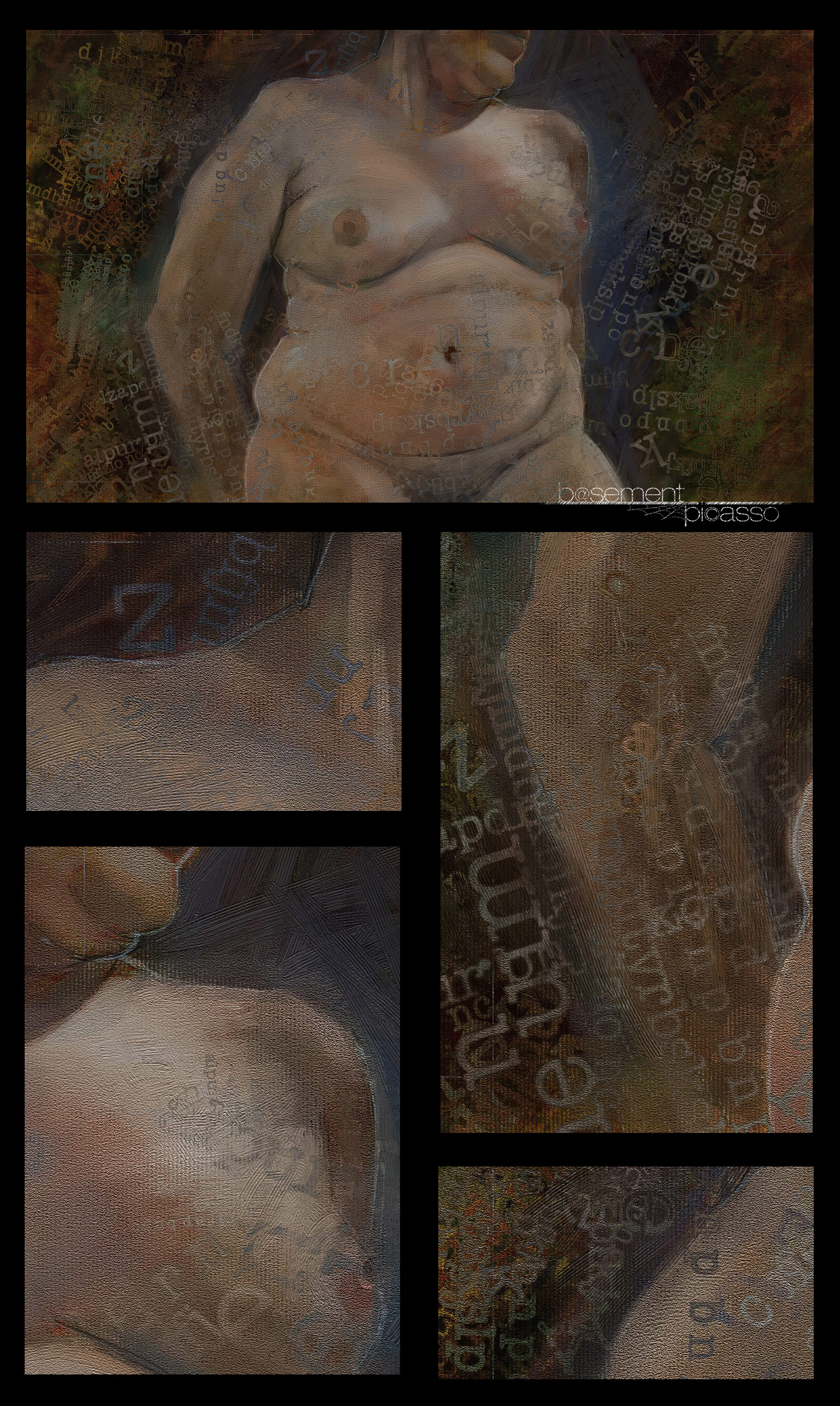
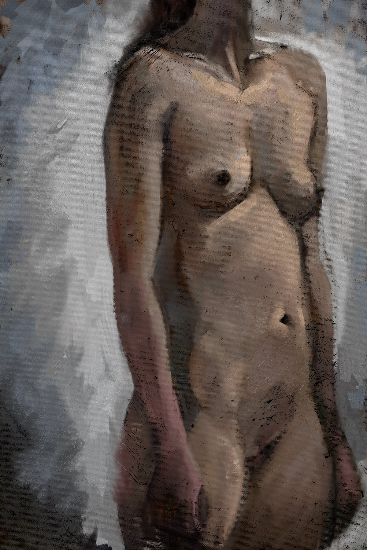
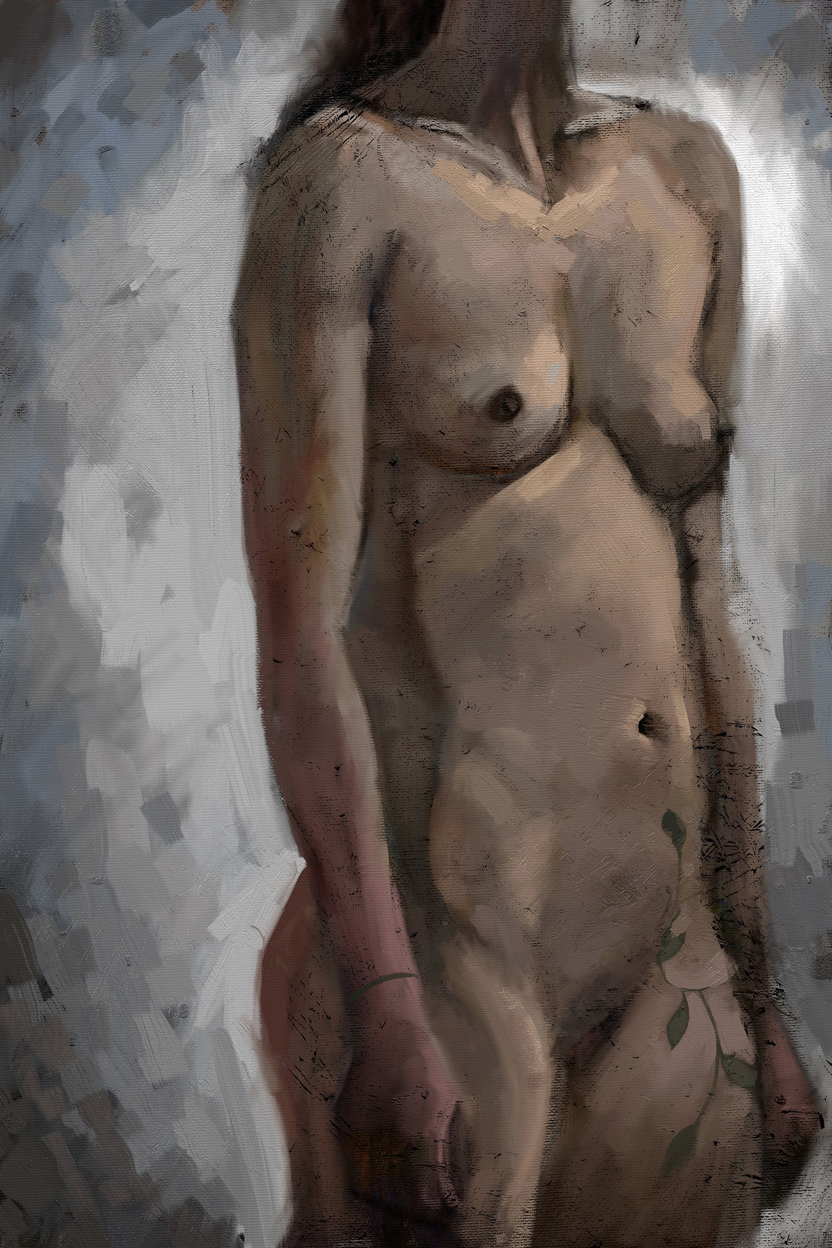
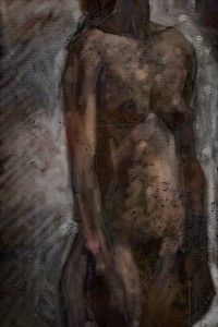
Another Saturday sketch done at Leith School of Art Saturday afternoon untutored life drawing.
Created in Artrage 4.5 on a surface pro 3 at 2880 by 4160 pixels. I started with a texture I had scanned originally and made a coloured background to start. My first sketches were the full figure which I almost always tend to do, so I decided to recompose to focus on the torso.


lsoa may23 b
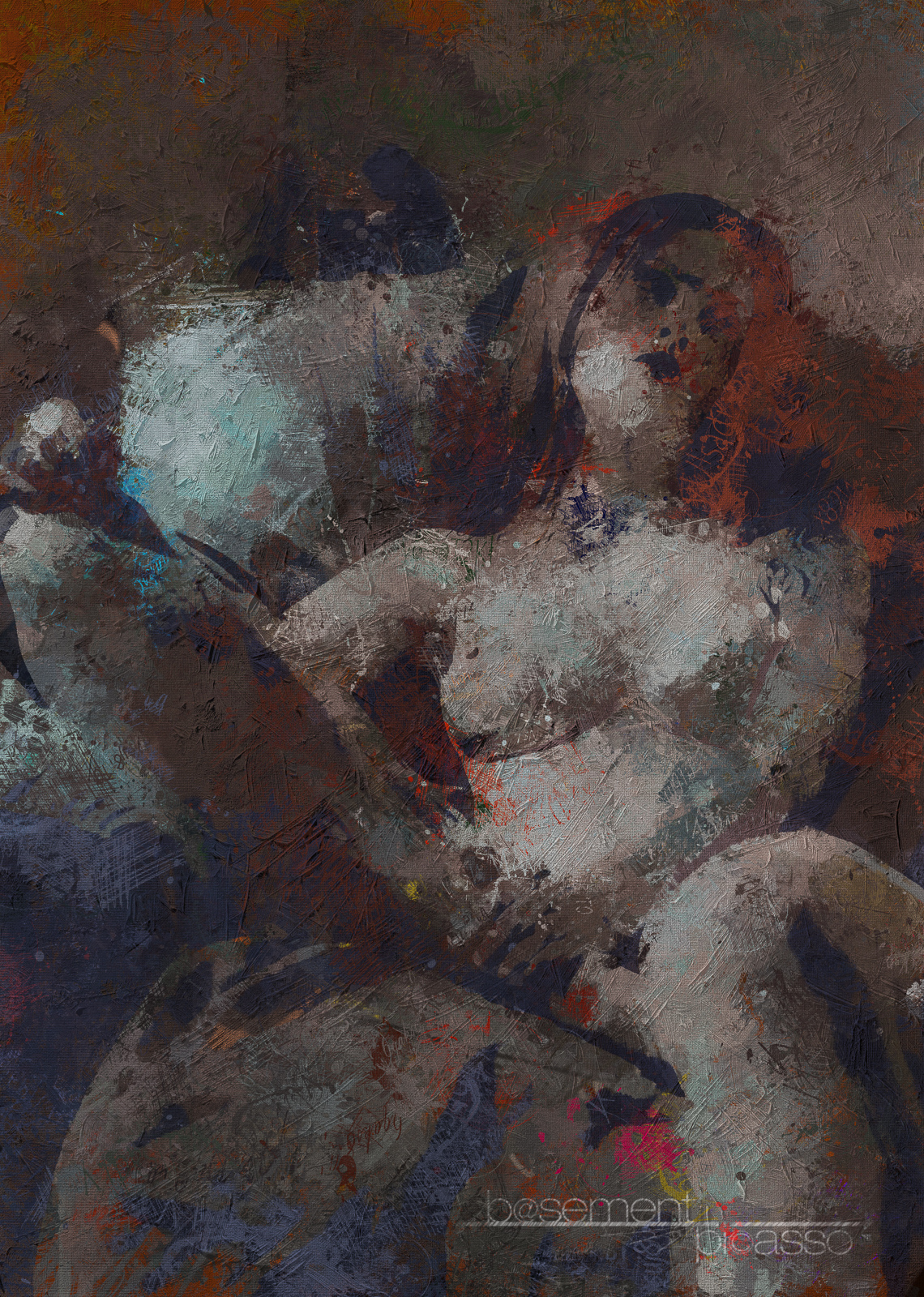
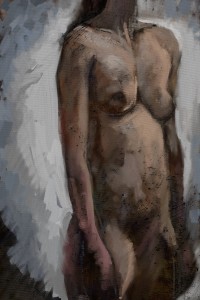
Was working essentially dark to light I took my time to build up the colours to allow the original colours to blend in.


I started with the oil pastel tools to get good colour blending, but after the first hour, started to build up with solid colour using the oil brushes.

lsoa may23 c


Will do a little post processing to add a bit more texture.


lsoa may23 d

Fantastic model – held a standing pose for 4 hours (with breaks) like a statue. respect.